With the recent dismay of many to the boxart for next year’s Bioshock Infinite, and Irrational’s Ken Levine making the case that such visual concerns are a marketing tool for garnering the interest of those unfamiliar with a game versus those already invested, I’m going to go sideways and give a nod to the cover for Naughty Dog’s upcoming post-apocalyptic tale, The Last of Us, which recently cemented its exclusive PlayStation 3 release date as May 7th, 2013.
Levine certainly isn’t wrong that the cover for any product is a critical marketing window to consumers, a key opportunity to make a statement about the product.
While The Last of Us doesn’t feature the rare punch to the face marketing pitch I might normally champion as a gamer, the image has grabbed me instead for its subtle message about the comprehension of the subject matter it aims to create a convincing world from for its characters, so much so that I feel the need to spew a few words exploring just how it does so below.


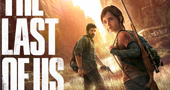
Naughty Dog’s cover uses key art that won’t prove unfamiliar to anyone following the game’s development, with our two central characters in a slightly adjusted yet familiar pose – with Joel anxiously waiting for Ellie to follow, as she looks behind them with mournful hesitation.
The entire image has a slightly faded look here, creating the idea of a dog-eared paperback novel that someone has been carrying around with them.
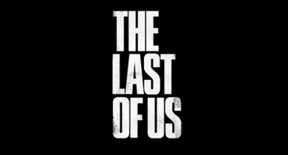
So it’s probably not accidental that the game has long sported stacked text for its title, which is slightly reminiscent of paperback apocalptica such as Richard Matheson’s 1953 novel, I Am Legend, and even more so of the more recent 2008 novel, City of Thieves by David Benioff.
While it may prove a bit abstract to convey the idea, the dog-eared sensibility I speak of has also leaked into the visual aesthetics of several post-apocalyptic films in recent years, including 2002’s 28 Days Later, 2006’s Children of Men, and 2010’s The Book of Eli.
Perhaps the best way to describe what I mean by dog-eared is to suggest that these films seek a realistic authenticity in a grainy world that resists the visual spit and polish that separates the antiseptic environments of the 2012 film Prometheus from the convincingly lived in world created in 1979 by the film Alien or even 1982’s Blade Runner.
The layering of the text creates a stark visual effect when simply set against a black background as well, which Naughty Dog has used throughout the year to add a dramatic punch to the end of trailers.
The actual key art for The Last of Us merits some interest as well, with our two characters hesitantly moving forward into a ruined city. The image acknowledges post-apocalyptic tradition while inverting it at the same time – at least, I’ve been racking my brain for another instance where characters are moving toward the ruins of society and have so far come up empty.
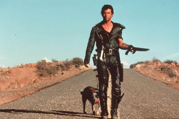
Whether it’s the iconic image of the Road Warrior emerging from the Wasteland, the more recent film adaption of I Am Legend, or even Ubisoft’s own kick at the post-apocalyptic landscape with the 2012 release of I Am Alive, the traditional image has been of a hero emerging from the the ruins of society, feeding an idea of hope in the perseverance of the species that rises from the ashes.

And then, of course, there’s the question of why any of this matters at all.
But just as gamers may often feel that publishers let them down in the boxart department, it’s also pretty rare that a release seems to appreciate and absorb the obvious cultural influences surrounding us.
It isn’t a matter of accusing one thing of copying another, but of appreciating the attention to works that proceed a fresh stab at a particular genre. And in recognizing this much detail in the boxart alone, there’s certainly every reason to believe that the game does more than simply drape itself in the trappings, but rather has the potential to make poignant insights and additions to the rich history of the genre.
What I don’t understand about BioShock’s box art is how their method works. Unfortunately, it seems true that it does, but I don’t get why. Ken Levine justified the “man with gun looking at camera” approach because it’s familiar and appeals to more people because it’s like other games they might have played. Who are these people who only buy games that look like other games they own? Where is the appeal in that? It also fails to convey any of the ideas that BioShock Infinite will supposedly deal with, whereas The Last of Us has art that represents the tone and mournfulness of the game we’ve been shown so far. I could ramble about everything from the placement of character to the “camera” angle and how they make The Last of Us’ box art miles ahead of the BioShock art.
Comment by Stuart Price — December 12, 2012 @ 5:56 pm
I really wish I had a good answer to this, because I asked myself the same question about “who” buys it based on that. I tried comparing it to times I’ve been at events and there are all sorts of fresh titles to sample and a lot of people still lined up for something like Halo Reach, some idea that people will often gravitate toward what they know for comfort.
I also tried thinking of other boxes that just had generic white armed male on the cover – it seems like the closest relative would actually be uncharted 3? Does that mean Levine is hoping to cash in on some extended audience that Sony snagged with Uncharted? I have no idea, just lots of question marks.
Comment by Jamie Love — December 12, 2012 @ 8:04 pm